Size does matter
Ross Mackie • 22nd Sep 2015
The user experience is of course all-important. And with almost 40% of traffic coming from mobiles and tablets this year (and predicted to overtake desktop traffic by 2017) these are all important things to take into consideration when designing any new site.
Saying all of that, I’ve chosen not to look at these three sites on a tablet or mobile. I haven’t even considered if the font will look good on an iPhone and Android device, or if the navigation is practical, if the images will hold at the smaller screen size, if my ‘fat fingers’ will be able to press one button at a time. I’ve chosen to indulge myself in sharing some sites that have a great immersive experience on a large monitor, so find yourself a 27 inch screen to fully appreciate the following sites!
These sites aren’t even necessarily easy to find your way around, but that’s part of the experience, finding out how they work. Exploring the site to see what’s clickable, discovering new ways to navigate, new ways to scroll. Some journeys, even user journeys, can be about discovery.
So put away your tablet or mobile phone, find a desktop with a large screen and just enjoy the sites as they’re intended.
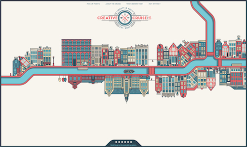
Beautifully illustrated, beautifully simple…and a horizontal scroller. [link]
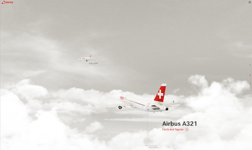
Full of nice touches, loads of areas to explore and you can track the flights in real-time! [link]
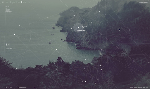
Just enjoy exploring using the quite unique navigation. [link]