We’re Employee Owned and B Corp certified!
Scottish Autism was at an impasse. Their brand was unmemorable and outdated – failing to grab attention in a society saturated with misinformation. Taking their values and hopes for the future of the charity, we created a visual identity that cut through the overwhelmingly purple landscape and positioned difference at its heart.
Insight
Brand awareness of Scottish Autism had completely stagnated over the past 5 years, with only 4 in 10 people recognising the charity. Alongside their unrecognisable branding, their website was difficult to navigate and failing in its purpose – inaccessible for autistic people looking for support. In a world that isn’t designed with autistic needs in mind, and one where misinformation is rife, this charity is a lifeline and it was critical that their breadth of support services were known.
With a range of audiences to appeal to and accessibility standards to meet, we spent 3 months working with charity and community representatives, including those with autism, to develop a brand that ensured every voice was heard.
Idea
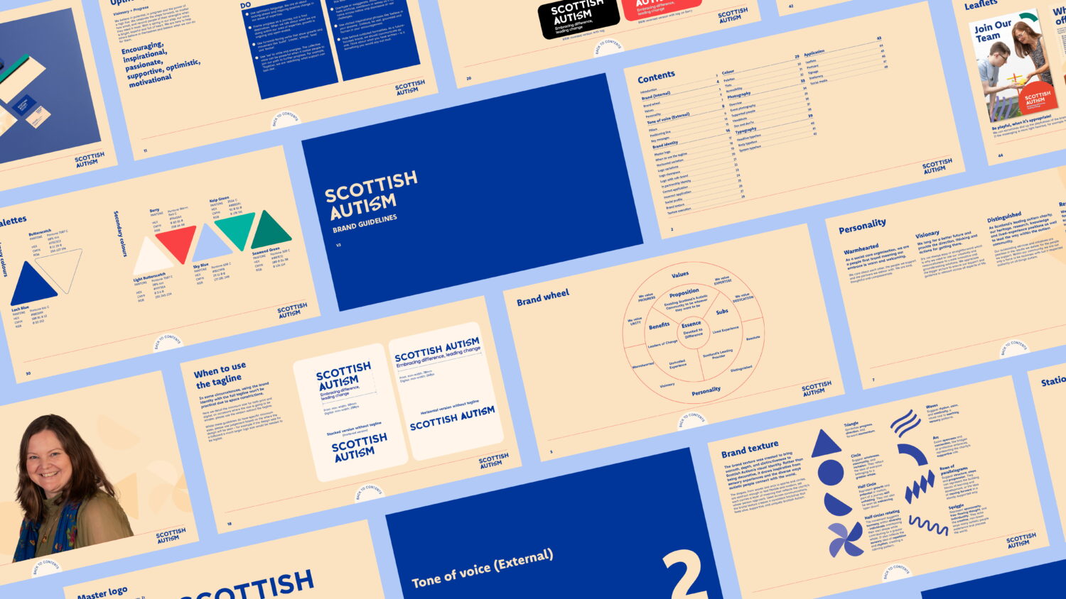
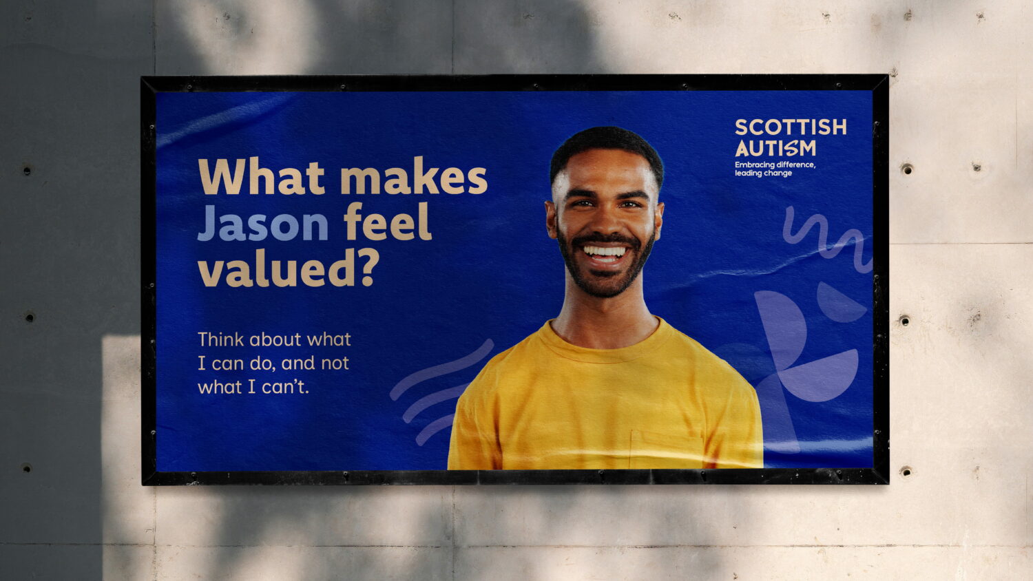
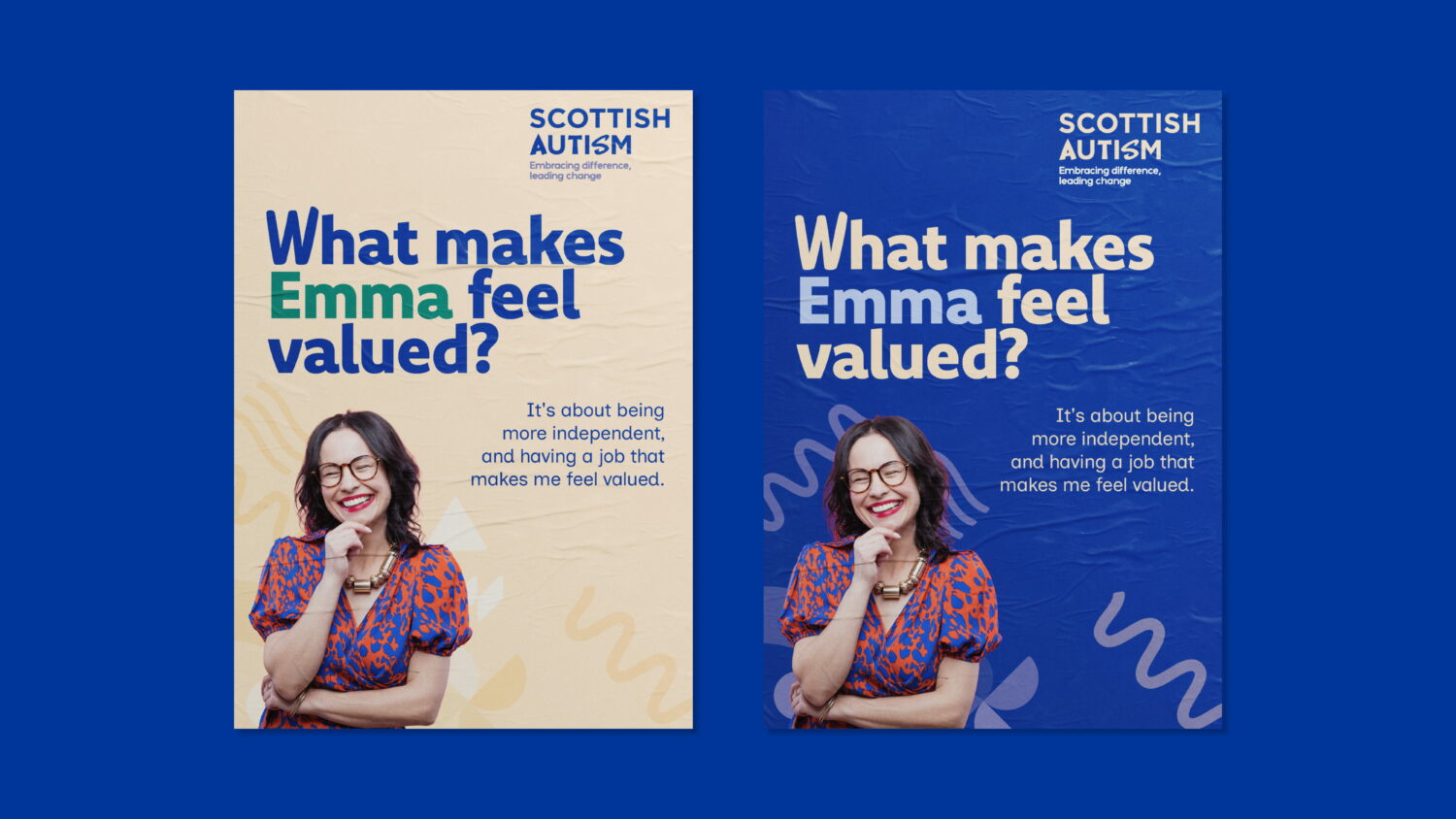
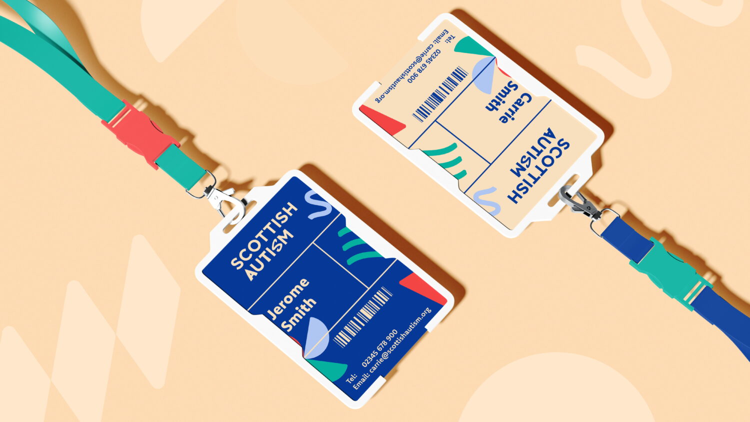
With a brand essence of ‘Devoted to Difference’, we created a visual identity that uses modern yet accessible colour combinations and celebrates different patterns of thinking.
We stayed true to the charity’s Scottishness with a deep blue brand colour that passed the Web Content Accessibility Guidelines (WCAG) with a triple A score, alongside the supporting butterscotch colour and white. We also included different tints of these colours, allowing the branding to be scaled across different communications.
As well as this, we incorporated contemporary shapes into the identity, drawing inspiration from diverse sensory experiences.
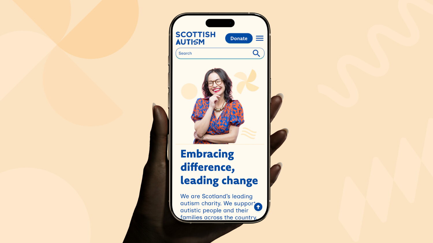
We applied this identity to the new website design, creating a site that is simple to navigate, visually interesting and accessible.
Impact
Despite accessibility obstacles and ensuring the branding was flexible to every audience, we crafted a brand identity that brought difference to the forefront and celebrated the autistic community. Their new website saw action and engagement increase, with more people reaching out for advice, education and support.
Thanks to the rebrand, Scottish Autism have a new confidence in their expert abilities, a new visual identity that helps promote positive awareness and a new website that clearly directs people to the support they deserve.
Scottish Autism were delighted with this brand refresh, commenting that: “Lane were able to get to the heart of our challenge with this rebrand – how to evolve a charity well known for our social care services into one where the breadth of our work was better known. From the start of the process they demonstrated a great understanding of who we were, and adapted their processes and outcomes to suit us.”
This rebrand was a step in the right direction. And a step away from misinformation and misunderstanding.
Silverburn gets a style upgrade
View Case Study Silverburn gets a style upgrade